|
|
 发表于 2009-4-16 01:07:09
|
显示全部楼层
发表于 2009-4-16 01:07:09
|
显示全部楼层
本帖最后由 Salomé 于 2009-4-16 07:09 编辑
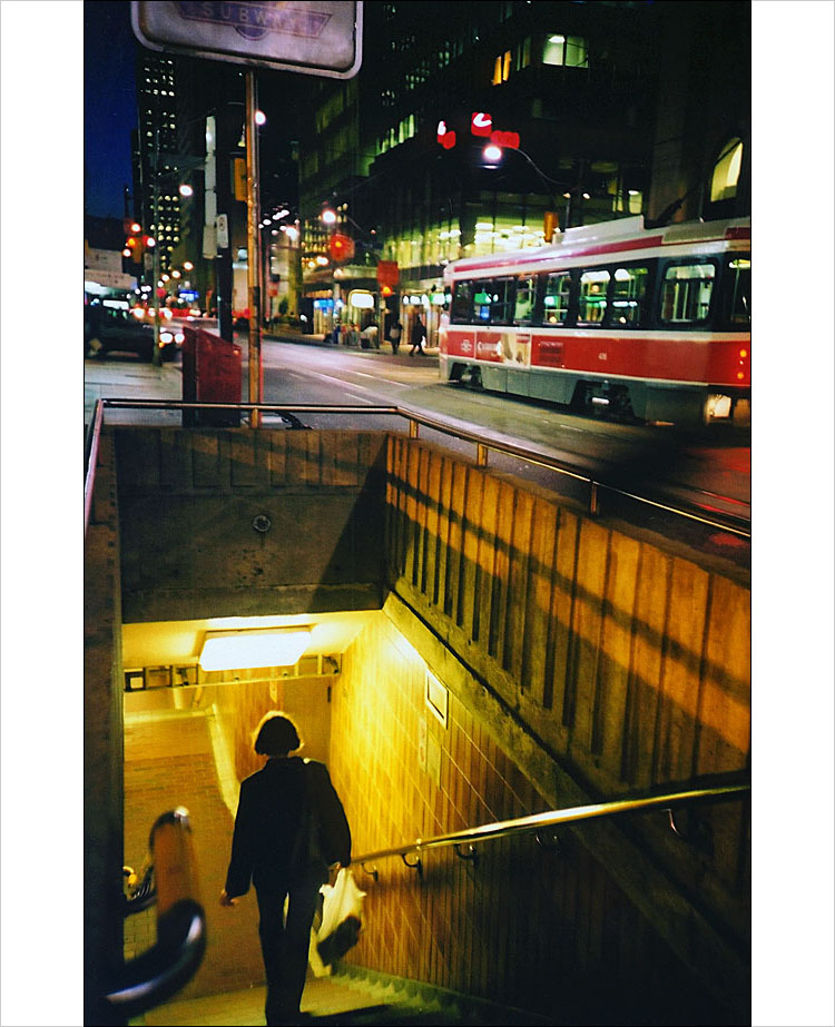
乡下人进城。。。。
春山 发表于 2009-4-15 19:17 
等你坐了这个,才知道什么是乡里老粪进城。。。
 。 。

When approaching something new, I believe the time that we need the most direction, whether it be learning how to play the clarinet (don’t laugh!), putting together your new IKEA EKTORP JENNYLUND chair, or learning Japanese so you know how to order a hot dog instead of a coffee (again don’t laugh!), is at the very beginning. Once we take a few steps, we generally pick up a few things as we go; understand a little more, making it easier each time that follows until it becomes routine and instinctive. The more intuitive the instructions are from the start, the quicker we tend to grasp how it works. This is especially true when it comes to figuring out directions. What is the key to clearly communicating one’s orientation? That’s right … design .. and this is how the Tokyo Metro begins…

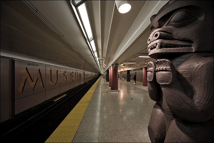
The front entrance. Easy to recognize and not too much different than most other entrances. Though, I should point out the subtlies that might at first go unnoticed. The irregular yellow brick pattern is there for a specific reason… to help aid the blind. This type of tile is consistent throughout not only the train station .. but the entire city of Tokyo.

The stairs are labeled as to which side of the walkway you should go up and down. This is helpful for Americans like myself because they walk on the wrong .. uh (d@mn American) .. opposite side of the hallway; just as they drive on the opposite side of the street than we are used to in the States. You go up the left and down the right… most of the time..
Ok, you are at the bottom of the steps of the Metro entrance. Perhaps a few bends and turns here or there but, on the whole, it was pretty straight forward so far. Now, important note.. and I have to find out figures that actually compare the two subway systems, but I can say with no actual proof that the Tokyo Metro subway system is UNBELIEVABLY larger than the NYC Transit. As the significance of this might not be clear, the challenges of orientation and maintanence multiply. Let me just say, though I have said it so many times, the Tokyo Metro is impeccably clean.
|
|


 发表于 2009-4-15 18:46:48
 提升卡
提升卡 置顶卡
置顶卡 沉默卡
沉默卡 喧嚣卡
喧嚣卡 变色卡
变色卡 显身卡
显身卡 发表于 2009-4-15 18:57:00
 楼主
楼主